TLN Brand Refresh
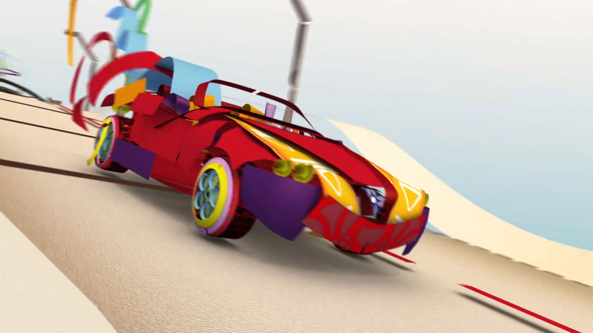
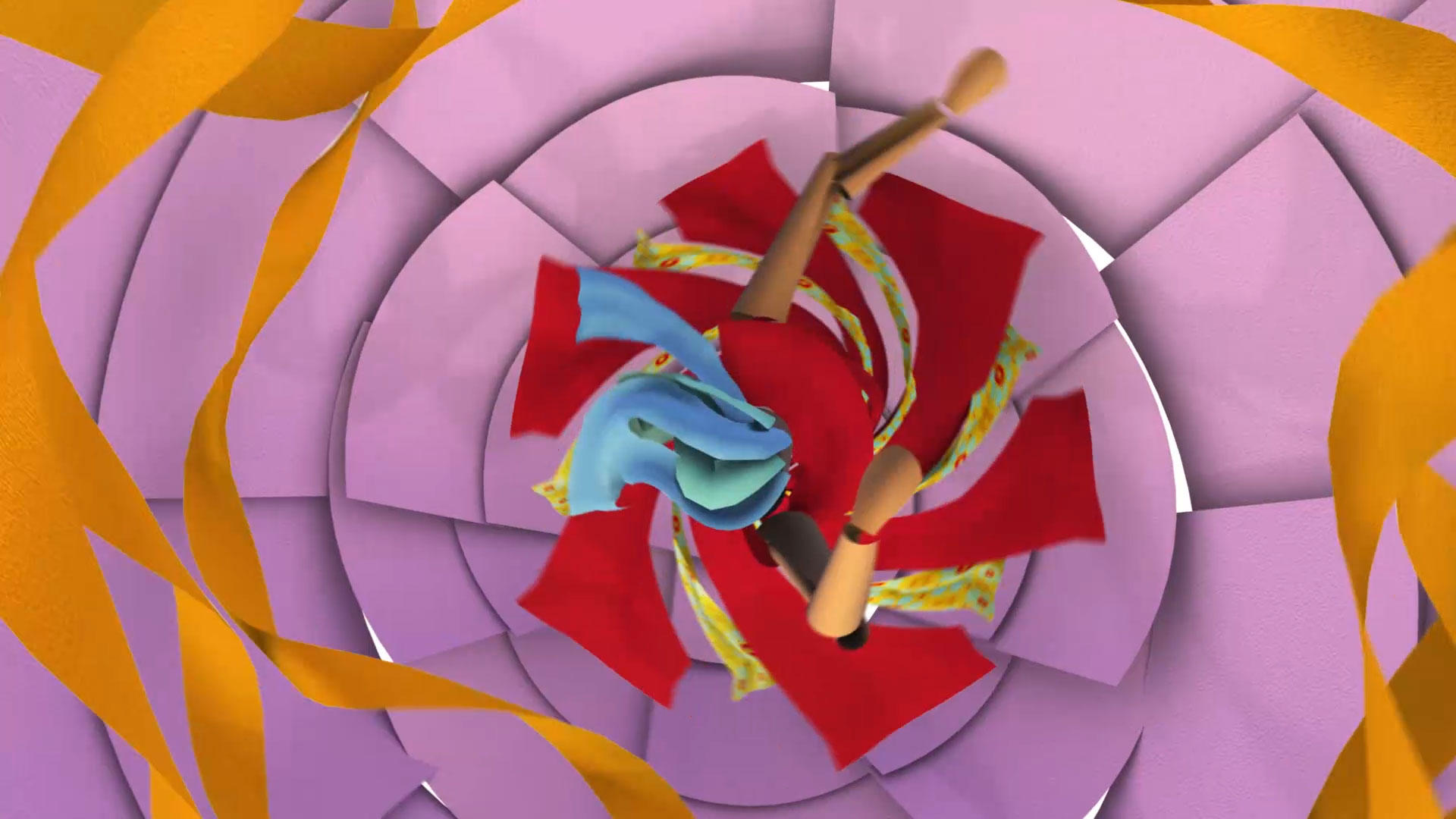
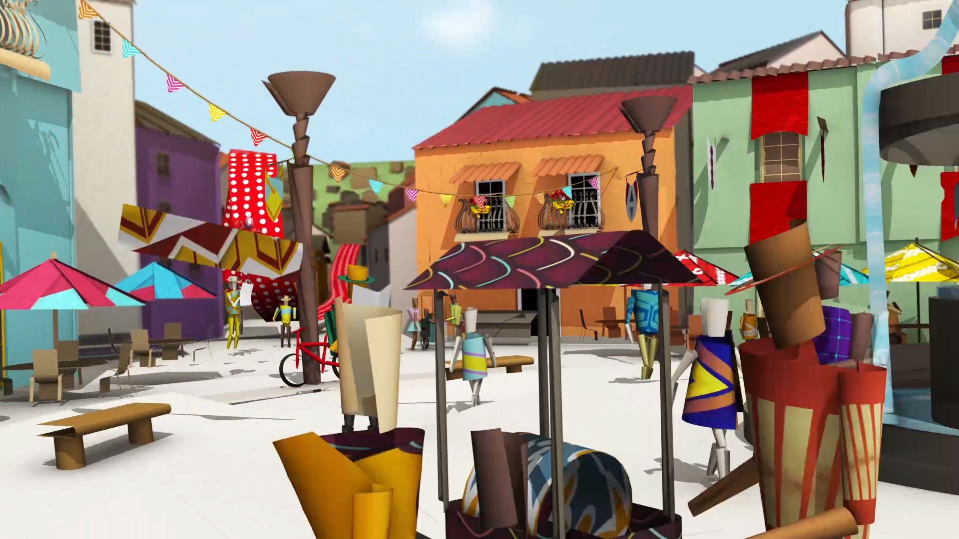
We engineered a refresh of the TLN brand, a major undertaking that included a refurbished logo. We set out to make the TLN logo more contemporary and streamlined – and also optimized to work across multiple platforms. As part of this process, we re-examined and refined TLN’s colour palette. For example, we took a sombre red and replaced it with Ferrari red, a brighter and more vital tone – and also a colour that resonated with the TLN’s Italian viewers and their sense of national pride. We also created a series of original hand-drawn designs resonant of Italian and Latin culture, providing unique accents and a strong sense of originality and ownership for the station. These accents – everything from dancing to cars to food – appear as a form of computer-generated paper, lending a textural feel and also giving the station flexibility to incorporate seasonal elements. Our work on the TLN brand helped revitalize the station’s identity, giving it a much more contemporary feel and leaving it better adapted to a multi-platform, multi-screen world.