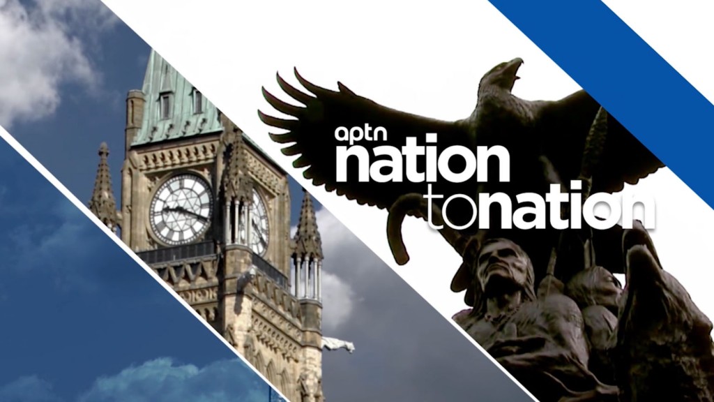
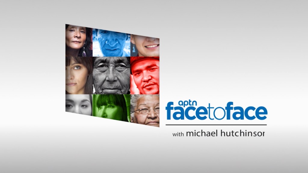
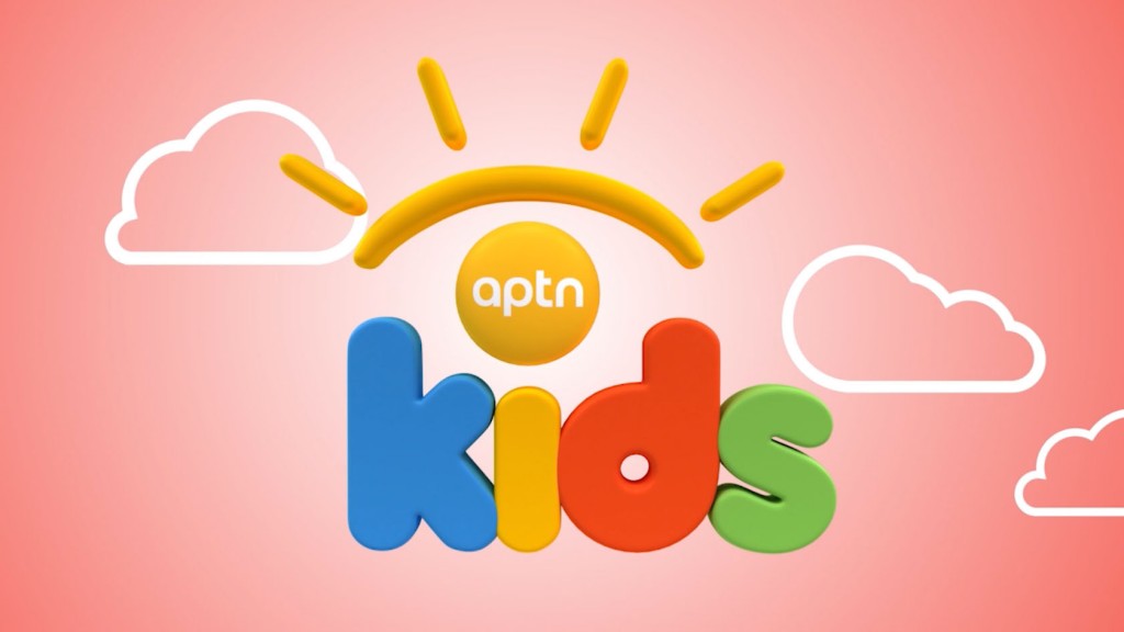
APTN BRAND REFRESH
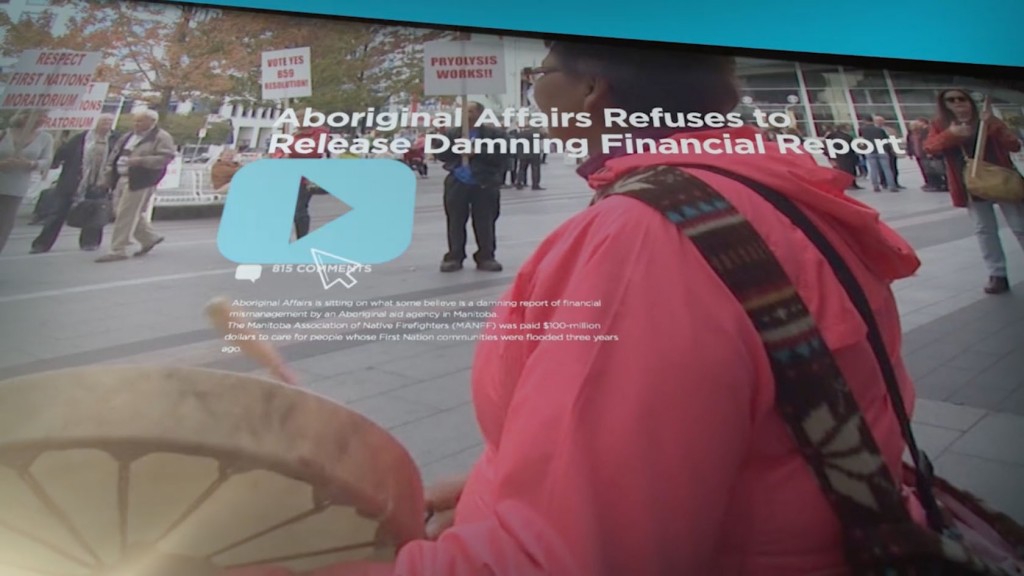
The Aboriginal Peoples Television Network (APTN) wanted to refresh their on-air branding to present a more modern, global presence. With direction from Craig Kirkham, we began with research and interviews, then a comprehensive brand identity exercise which showed what made APTN a unique broadcaster: their perspective. Through award-winning investigative journalism and original storytelling they presented a different way of looking at the world. We began with a simple tagline Stories only we can tell. We then designed a shape—a trapezoid—to symbolize an alternate view, then broke it down into own-able, defining colours and shapes that created an approachable, stylized feel for the master brand. We then updated their logo to be seen clearly across multiple platforms and devices. Bold colours, distinct lines and signature animations brought their formerly disparate shows and on-air branding together to form a strong, cohesive network identity.